Tattered Angels: The Power of Colors
by nathalie, at 7:08 am
Design Team : Layouts : Products | permalink | rss
Fall is in full force here and although I’m a total summer girl- I have always also loved Fall. Things are calming down and …although especially in rainy Hamburg…I get the blues some days in Fall, I absolutely love the colors that nature has to offer at this time around!
I love to reflect my feelings above about fall in the colors of my layout “Simple Beautiful Fall”:

For the blue feeling that goes along with fall I chose the wonderful Chalkboard Colors Cornflower and Concord. I had spread some white acrylic paint over the Garden Lattice Screen and then sprayed the Chalkbaords right over it into the still wet acrylic paint. For the beautiful Simple Sayings Title from Heidi Swapps Collection and the wonderful frame that I cut out of the new paper Misting Magic, I used the Glimmer Mist Fall Color Sugar Maple and the Winter Color Jingle Bells. I used the same Colors also for the Framed Fonts.
Colors are such a wonderful way to express feelings and emotions- it is one of my favorite design tools- try it ![]()
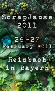
If you want to visit one of my workshops in the future I would love to have you - or contact me if you want me to come. You can find me teaching some new Tattered Angels Workshops for example here:
Paper & Co Show 2010, France - 26-28 November 2010


Comments
October 16, 2010 @ 9:44 am, by Stine Maansen
October 16, 2010 @ 9:46 am, by seemycrafts
October 16, 2010 @ 10:44 am, by Kim Sonksen
October 16, 2010 @ 10:59 am, by
October 16, 2010 @ 2:04 pm, by Sue Clarke
Add a comment